Madiha Jan

Madiha Jan

Park AllWays
Accessible Parking Platform.
Konnect is a mobile-first platform designed to improve accessibility and reliability in parking for people with mobility challenges. The goal was to create a seamless experience that allows users to find, reserve, and pay for accessible parking with confidence.
This project focuses on scalable UI design, system thinking, and accessibility-first interaction design.
UX DESIGN CHALLENGE:
Iterate UX
TEAM:
Four creative individuals:
Mythili Ravishankar, Tania Verma, Bhupinder Bath, and myself.
MY ROLE:
UX Designer, Project Manager, UI Design & Visual System, Component Design & Design System Development
DURATION:
August 14th – September 17th 2023

Out of 24 teams, our team was selected as one of the top 6 to showcase our work in front of the judges.
About the organizer:

Iterate UX is a non-profit, community-centred platform for hands-on learning. They organize different Virtual Events, Design Challenges, Portfolio and Resume Reviews, Whiteboard Challenges, and Interview Mockups.
UX Design Challenge:
Our project came to life by participating in the UX Design Challenge organized by IterateUX. We were given five industries to choose from:-
- Health & Fitness
- E-commerce
- Education
- Travel
- Accessibility
We opted for the Accessibility Design Challenge.
Accessibility Design Prompt given by IterateUX:
Develop a parking app that caters to diverse users, including those with disabilities. Design features such as reserved accessible parking spots, real-time availability updates, and a seamless payment process that considers various user needs.
Reasons why we choose the Accessibility Prompt:
- Build a solid case study for my portfolio
- The topic is both challenging and rewarding, offering numerous possibilities for exploration
- Less saturated market: Not so many apps for physically challenged people
- There is a high demand for accessibility features in both apps and websites. Almost everyone wants to ensure their digital products are accessible to all users
Project Goal:
Design a comprehensive parking app meticulously tailored to address the distinct requirements of physically challenged people, ensuring accessible and hassle-free parking experiences.

Problem:
Accessible parking today is:
- Inconsistent and difficult to locate
- Frequently misused or unavailable
- Lacking real-time visibility
Users need a system that is:
- Reliable
- Easy to navigate
- Designed for accessibility from the ground up
Solution:
Designed a mobile app experience supported by a scalable UI system, enabling:
- Real-time parking availability
- Reservation and payment flow
- Accessibility-first interactions
The focus was not just on screens—but on building a consistent, reusable design foundation.

The app guarantees a stress-free parking experience for both drivers and passengers. Drivers can relax knowing they’ll find a parking spot, while passengers are assured of being dropped off at a reserved location.
PRODUCT THINKING & SYSTEM DESIGN:
Rather than designing isolated screens, Park Allways was approached as a scalable product system.
Core experience layers:
- Discovery Layer → search and filtering
- Booking Layer → reservation and payment
- Management Layer → tracking and history
👉 Designed as a connected system, not separate features.
Four Main Features:
- Search for Free or Paid Real-Time Accessible Parking Spots
2. Report a Violation for the Misuse of an Accessible Parking Spot
3. Reserve an Accessible Parking Spot before Time.
4. Book an Accessible Ride
- Search for Free or Paid Real-Time Accessible Parking Spots
- Report a Violation for the Misuse of an Accessible Parking Spot
- Reserve an Accessible Parking Spot before Time.
- Book an Accessible Ride
1. Search for Free or Paid Real-Time Accessible Parking Spots
- Search Option: There are two ways to find accessible parking either by zone ID or by location. The search button allows users to quickly find accessible parking spots based on their current location or by entering a specific destination.
- AI Voice Assistant: This AI-powered assistant can enhance accessibility and usability by providing spoken guidance for finding accessible parking spots and answering questions through voice commands.
- Car Locator: A new feature is available to help users remember where they parked their vehicle. It is greyed out until a location is selected.
- Free and Paid Parking Options: Find real-time availability of parking spots, including both free and paid options. The indicators are color-coded for easy identification.
- Amenities at the Parking Spot: Users can check the amenities that are available at the selected parking spot.
- Search Along the Route: Different options are available that can be added to the trip like gas stations, cafes, restaurants, and much more.
- Turn-by-Turn Voice-Guided Navigation: This enhances accessibility, safety, and independence for disabled drivers, making it an essential tool for their everyday travel needs.
2. Report a Violation for the Misuse of an Accessible Parking Spot
100% of our users complaint about the misuse of the parking spot.
Reporting violations helps ensure fairness in parking. It discourages individuals from wrongly occupying accessible spots, which can lead to frustration and inconvenience for people with disabilities. In many regions, parking in accessible spots without proper authorization is against the law. Reporting violations can contribute to enforcing these regulations and holding violators accountable.
How does it work?
- Select the location
- Select the type of violation
- Take 3 photos
- Submit
3. Reserve an Accessible Parking Spot before Time.
“Reserve a Parking Spot” is a hassle-free option that ensures you have an accessible parking space waiting for you at your chosen location. This feature is designed to make your parking experience convenient and stress-free.
- Select Date and Time: To secure a parking space, input the date, as well as the start and end times. Complete the payment process to confirm your reservation.
- QR Code: The user will be provided with a QR code that they can scan at the designated spot upon arrival.
- Extend Parking Reservation: Users can easily prolong their parking time without needing to physically return to the parking spot. Users can enjoy their activities without worrying about parking expirations.
The app will send users a notification one hour prior to the end time, ensuring they can manage their parking without stress.
4. Book an Accessible Ride
It has two options. There is a common feature in both options that they choose what kind of vehicle they will be needing, regular or assisted.
- Book a Solo Ride: It is a convenient option designed for users who prefer to travel independently.
- Book a Ride with Someone: This is a collaborative feature that allows users to share a ride with another user heading to a similar location.
Key Benefits:
– Cost Sharing: Split the fare with another user, making transportation more affordable.
– Community Connection: Meet and interact with fellow users travelling to nearby destinations.
– Environmental Impact: Contribute to a more sustainable environment by carpooling.
5. Dark Mode
Dark mode has gained popularity among a broad range of users, including those with disabilities, for the reasons, such as reduced eye strain, improved readability, and reduced sensitivity to light. To ensure inclusivity and accessibility in our design, we provide the option for our users to switch between dark and light modes. This way, users can choose the mode that best suits their needs and preferences, regardless of disability status.
USER EXPERIENCE DESIGN:
Focused on:
- Reducing cognitive load
- Improving navigation clarity
- Creating predictable, intuitive flows
Every interaction was designed to:
👉 minimize hesitation
👉 increase user confidence
DESIGN SYSTEM & COMPONENT LIBRARY:
System Foundations:
- Defined typography scale for readability and hierarchy
- Built a colour system to communicate availability, status, and actions
- Established spacing, grid, and layout consistency across screens
Component Design:
Designed reusable UI components to ensure consistency and scalability:
- Buttons (primary, secondary, disabled, active states)
- Cards (parking listings, summaries, confirmations)
- Input fields and filters
- Navigation and tab systems
- Status indicators (availability, booking states)
Each component includes:
- Multiple interaction states
- Consistent spacing and alignment
- Accessibility considerations
Component Library & Reusability:
- Structured components into a reusable system
- Ensured consistency across all user flows
- Reduced redundancy and improved design efficiency
👉 Shifted approach from screen-based design → system-based design
Scalability:
The system was designed to:
- Support additional features (subscriptions, alerts, history)
- Maintain consistency across new screens
- Enable faster iteration and development handoff
👉 Result: a flexible and scalable product foundation
Unlocking Potential:
Creating a parking application designed to cater to users with disabilities requires careful planning, prioritizing the needs of the user, and a firm commitment to accessibility. This involves addressing technological, design, and regulatory challenges to ensure that the application is functional and user-friendly for everyone, irrespective of their abilities.
Major Improvements in the Design
- Switching from five options in the navigation bar to three was a major decision. To keep things simple for the physically challenged people.
- Adding a car locator on the home screen made things easier for the users.
- Adding an assisted vehicle for booking a ride made things easier for our secondary target audience.
- Light and dark modes ensure inclusivity and accessibility in our design, we provide the option for our users to switch between dark and light modes. This way, users can choose the mode that best suits their needs and preferences, regardless of disability status.
Home Screen Iterations

UX CASE STUDY
Dive Deeper
Let’s start with understanding the users' needs
INITIAL RESEARCH
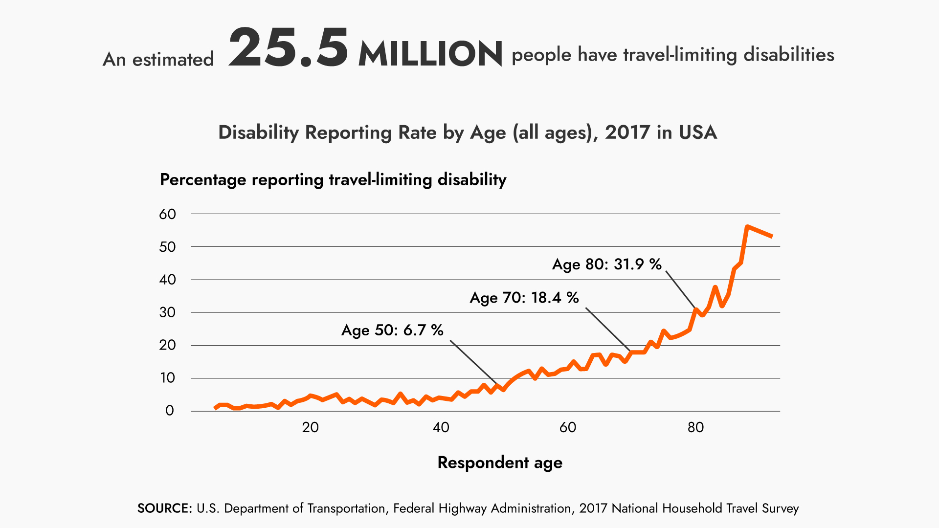
In this UX Design Challenge, two team members were from Canada and two from the USA. To better understand the problem, we analyzed data and perspectives from both countries.
What is a disability?
Physical or mental impairment that substantially limits one or more major life activities.
Canadian Stats


USA Stats

Crafting User-Centric Experiences: Our Methodology in Action

Informed Assumptions: Guiding our Design Strategy
- Physically disabled people have difficulty finding an easily accessible parking space.
- Those people find it difficult to get access to some basic requirements like wheelchair access, restrooms, and shopping carts in their vicinity.
- Physically handicapped people have difficulty in drop and pickup reservations for themselves to get to their appointments.
- Physically challenged people gets anxious whether they might get the parking space due to limited number of spots.
- Those people get anxious if they have booked the parking spot in advance but might not be sure that they will get it when they reach their destination.
Understanding Our Audience
The next step in our initial research was to define our target audience. To address this concern we decided to target both drivers and passengers with some kind of disability.

Market Landscape Analysis: Identifying Design Opportunities
We analyzed the competition to know how to stand out in a specific need. In our search, we discovered a total of seven applications, and during our evaluation process, we identified both positive and negative aspects within each of these apps.
We identified two primary competitors and five secondary competitors, and then we did research on the tertiary competitors in the market targeting the disabled population.

Tertiary Competitors
Additional organizations, interest groups, influencers, etc. that have vested interest in our market.

User Insights Discovery: Unveiling User Perspectives
We conducted user interviews to gain valuable insights into their needs, preferences, and pain points. This deeper understanding of our target audience allowed us to create more effective and user-centric solutions.
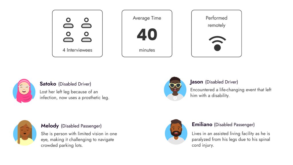
Key Findings from the Interviews
We needed to first gain a comprehensive understanding of the problems. Hence based on our user interviews we first listed the key problems our users are facing and the impacts it had on them.


After the interviews and key findings, all our hypotheses were validated.
How we formulated the problem statement?
While formulating our problem statement, we employed an iterative interrogative approach known as the “Five W’s.” This technique delves into cause-and-effect relationships that underlie a specific issue, aiming to ascertain the root cause of a problem and identify potential solutions. The fundamental objective of this technique is to uncover the core reasons behind the challenge and develop strategies to effectively address it.
5 W's

5 W’s Approach

User Archetypes: Navigating User Characteristics
From the insights gained from our interviews, we developed two personas that represented our core users.
ALEX: “An Independent Professional”
Who thrives on independence and efficiency. He navigates life in a wheelchair due to a spinal cord injury.
TAYLOR: “A Vibrant Explorer”
Who exudes independence despite her congenital mobility impairment. She resides in an assisted living facility, relying on caregivers for transportation.


Pattern Recognition: Synthesizing Insights
To better understand the different categories under which our users had their pain points, we created affinity map from the raw data gathered from the user interviews. This map enabled us to identify recurring patterns and shared aspects among our participants.

Key Findings from the Affinity Map
- Delays in finding accessible parking spots
- Lack of awareness of their disabilities and their needs among other people
- Lack of real-time availability updates
- Misuse of accessible parking spots by non-disabled drivers
- Need a secure and seamless payment method
- Turn-by-turn navigation
- Maintenance of parking spots
Information Organization: Collaborative Sorting
To better understand Information Architecture and the different features we will include in our App, we did a card-sorting activity with the data that we got from our participants. Based on all the data that we gather from our affinity mapping and card sorting we filter different key features that we will be including in our App.

Key Features

Real time updates
- Free & Paid parking spots
- Amenities at the spot
- Turn-by-turn navigation
- Add a spot
- Weather forecast

Services
- Parking reservation
- Seamless payment
- Report violation
- Car locator
- Extend reservation time
- Book a ride
- AI Voice Assistant

Activities
- Reservation history
- Parking history
- Favourite location

Customization
- Text to speech
- Light/Dark mode
- Text size
- Notifications
- Languages
- Location
The Design
Let's design a user-friendly app
User Journey Visualization
To ensure that we have a comprehensive grasp of the app’s flow, we developed a flowchart to gain a thorough understanding of our app’s features and functionalities.

Structural Blueprint
We then created the low-fidelity wireframes to outline the basic structure and layout of our app interface and continue to iterate our user flows and features.

Design System for a Cohesive Look
We were asked to use an existing design system as we’ve only a few days to prototype. We chose Alaya a Figma UI kit by Allan as our design system. The main reason to choose this kit is that it has both light and dark modes. To create an inclusive and accessible user interface, it’s essential to offer both light and dark mode options and allow users to choose their preferred mode based on their specific needs and preferences. This flexibility ensures that users with disabilities can customize their digital experience to suit their comfort and usability requirements.

Colour Palette
For our primary secondary and tertiary colours we choose the bright colours because these visible colours can provide good contrast against many backgrounds, making it potentially suitable for users with visual impairments or those who require elements to stand out.
We make sure that our design should prioritize a balance of colors and consider factors like contrast ratios, user preferences, and the overall user experience.

Web Content Accessibility Guidelines (WCAG)
We wanted to make sure that our app follows the wcag.

Jost is a San Serif Google Font which is designed with accessibility in mind. It adheres to web accessibility standards, ensuring that text is readable by users with various disabilities, including those who use screen readers.

Grid & Dimensions of the Elements
The Alaya design system has many components for both modes which we use to make our App consistent and visually appealing.

The Name for the APP
Park + Always
Park + All + Ways
Park AllWays
The name “Park AllWays” was chosen to convey the idea that the app provides parking solutions for everyone, in all situations, and at all times.
- “Park” emphasizes the core function of the app, which is to help users find accessible parking spots conveniently.
- “All” signifies inclusivity, suggesting that the app is designed to cater to all individuals, including those with disabilities, ensuring equitable access to parking.
- “Ways” implies versatility and flexibility. The app offers multiple ways to find and reserve parking spots, accommodating various user preferences and needs.
So, “Park AllWays” was selected to reflect the app’s mission of making parking accessible and convenient for everyone, regardless of their mobility or disability status.
Logo Design
I created some sample logos

This was the final Logo, we aimed for simplicity and cleanliness to effectively communicate our brand’s message.


Lessons learned:
We encountered some challenges during this project. Some of the lessons learned during our journey were:
- One of the biggest challenges was collaborating within a limited timeframe as the project required intensive work. However, this challenge exposed us to new areas and helped us in understanding in working on our key skills.
- I often find myself volunteering for too many tasks, which distracts me and increases the risk of not completing the work properly, causing stress.
- Develop a deep understanding of the daily challenges faced by disabled users to create empathetic and effective solutions.
- This project was extremely beneficial in helping me comprehend the significance of thorough research. I made use of extensive research to gain a better understanding of the subject matter. which was really crucial for our project.
What I’d do differently next time:
- The foundation is everything: Since the beginning, I spent the most time perfecting the presentation, which could have allowed me to focus more on the tasks assigned each week.
- Usability Validation: While time constraints prevented us from conducting comprehensive user testing, I would make time to gather feedback on the usability, functionality, and overall user experience to collect data that would identify areas for improvement, validate design decisions, and ensure the final product aligns with the needs and expectations of its intended users.
Next steps:
- How to employ a mechanism that temporarily locks your reserved spot to prevent others from taking it.
- Assisted parking experience for senior citizens, and people with disabilities.
- Collaborate with the government and other organizations to assist disabled drivers and passengers.