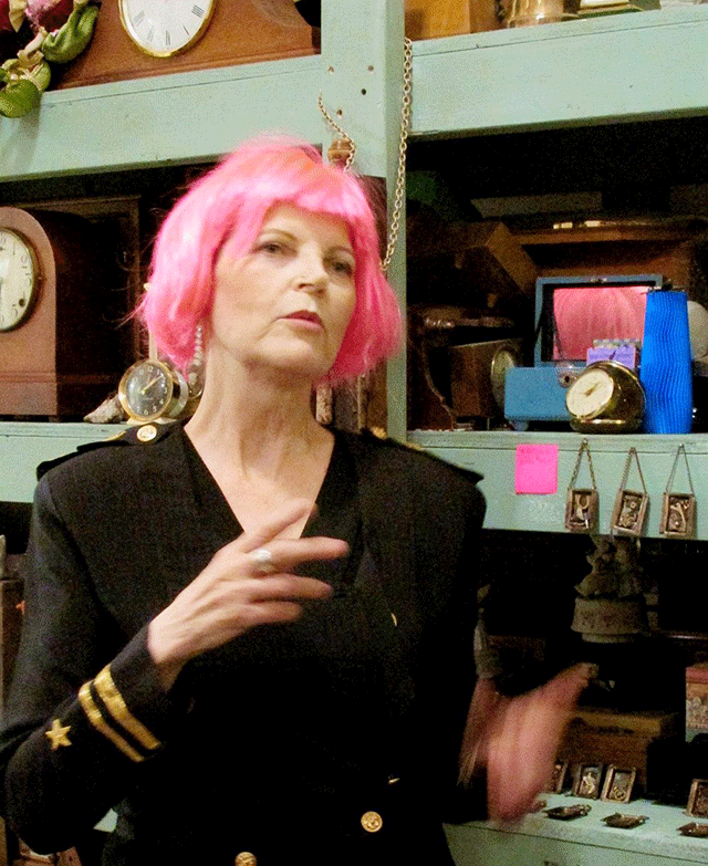
June Conley is a Vancouver-based assemblage artist with a studio in Horsefly, near Williams Lake, where she builds stories from what others discard. Rusted metal, worn wood, discarded textiles, broken watches, tiny relics of other lives, and clock parts form her visual language. Through her studio, Joon et al, she invites us into a space where time, memory and material intersect. Her output is more than sculpture; it’s storytelling in fragments, felt rather than told.
Challenge:
June’s work lives in the space between art and artifact; layered, raw, and deeply human.
Create a digital identity that felt handcrafted, intimate, and non-corporate, reflecting June’s studio practice
Translate the tactile nature of assemblage work into a quiet, bold digital experience without losing warmth or depth
A visual system that could complement her assemblages without competing with them. Every element, from typography to colour palette, had to preserve the imperfections, texture, and stillness that define Joon et al.
Solution:
From the beginning, she was clear: nothing polished, nothing corporate. The brand needed to feel like her studio; part curiosity shop, part archive, part shrine. Ticking clocks. Stacks of old drawers. Dust and gold. To address this, I consider the following steps:
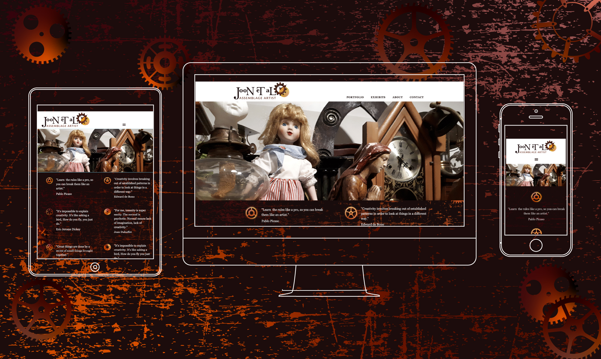
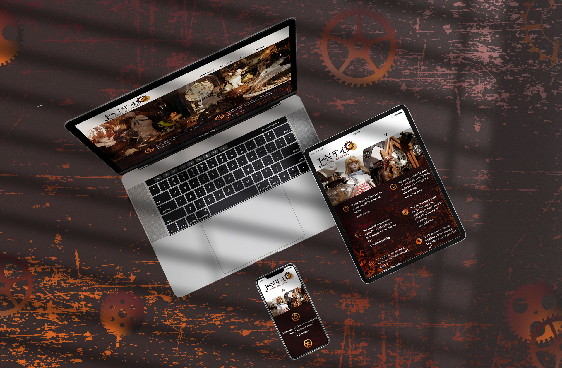
Tactile to digital: Translated the warmth and materiality of assemblage work into a quiet, bold website that still feels handcrafted. The goal was to create a space that felt handmade and human, even through pixels and screens.
Design restraint: Balanced raw texture with refinement so the design supports the artwork without competing with it. Too minimal, and the spirit of her work would disappear; too decorative, and the design would compete with her art.
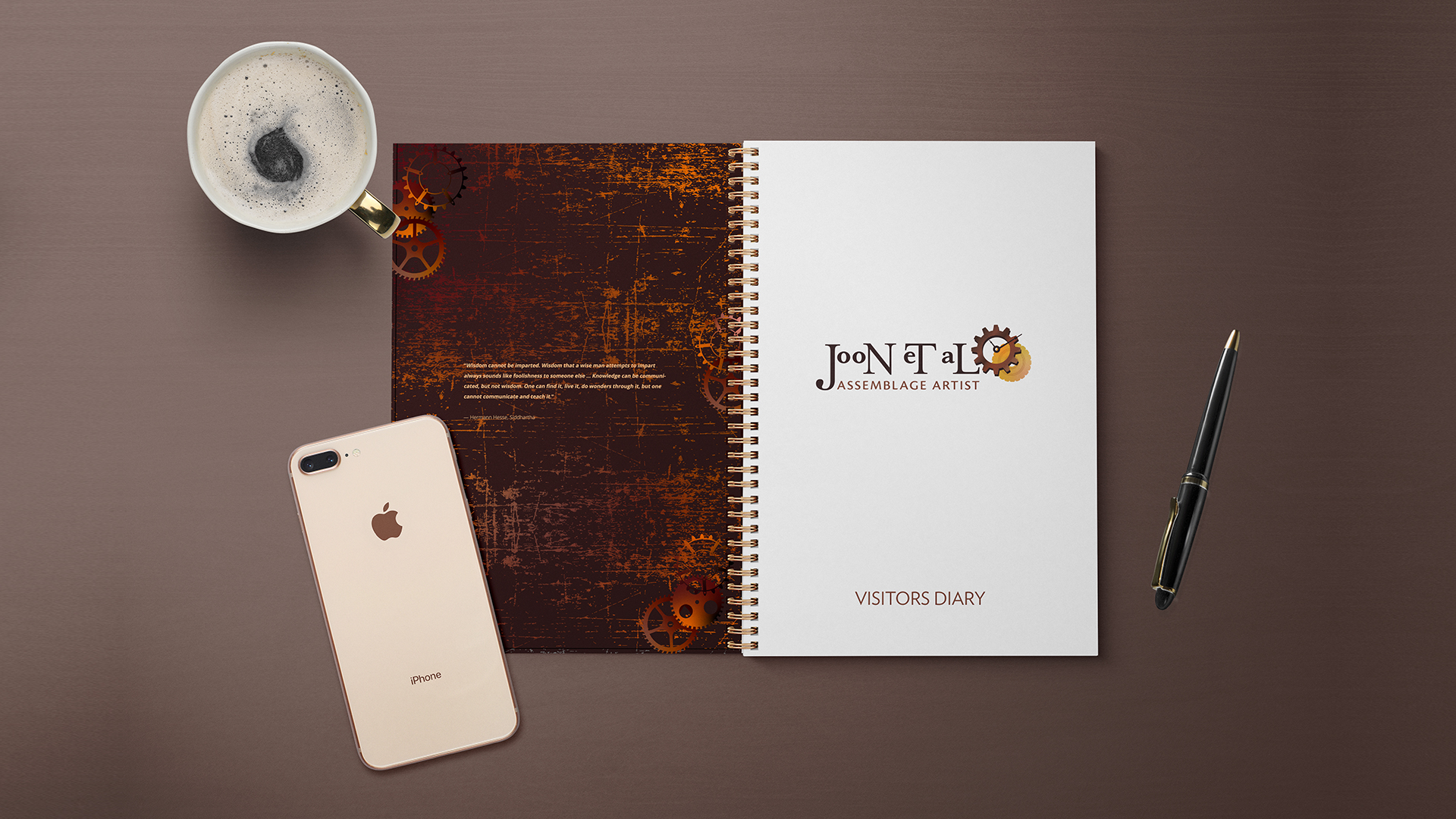
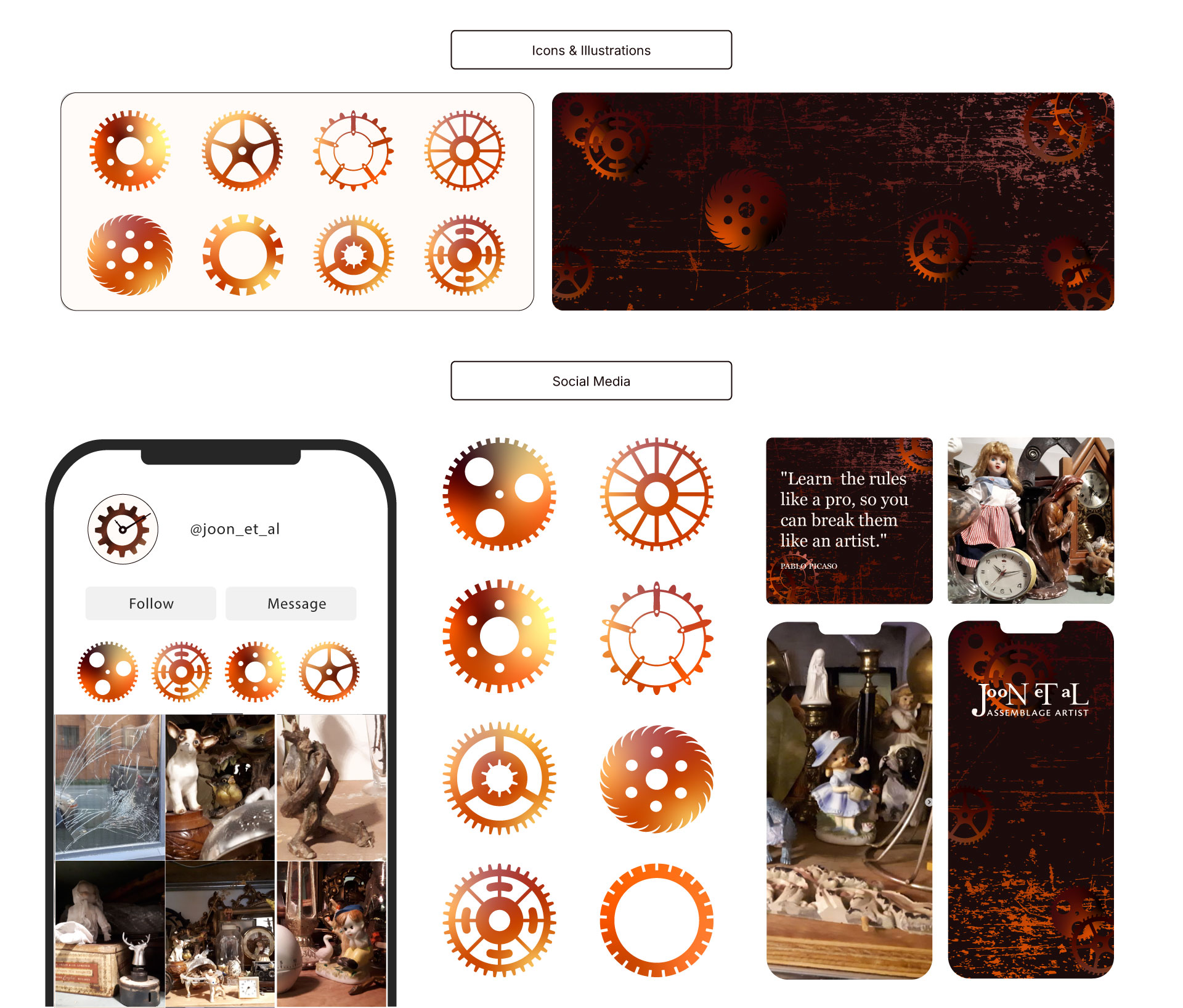
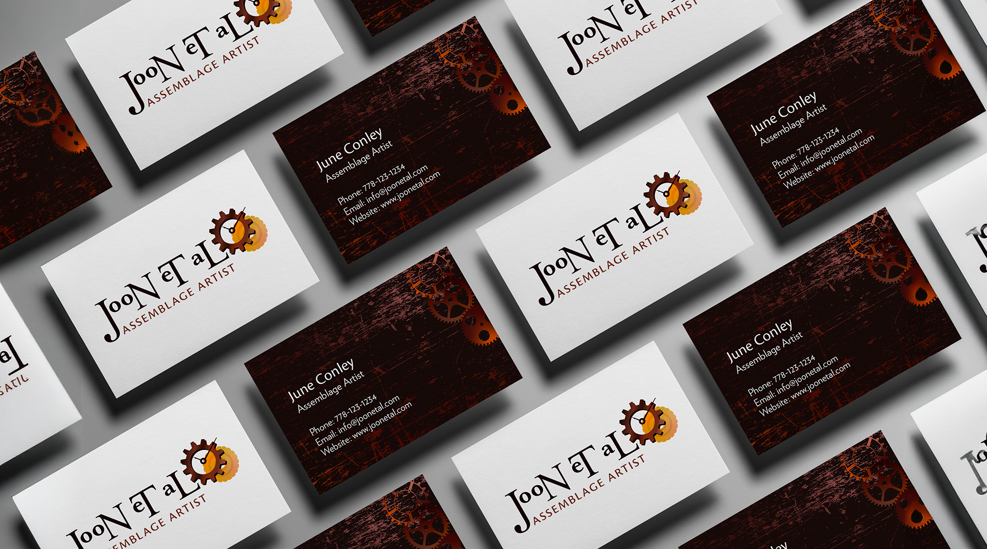
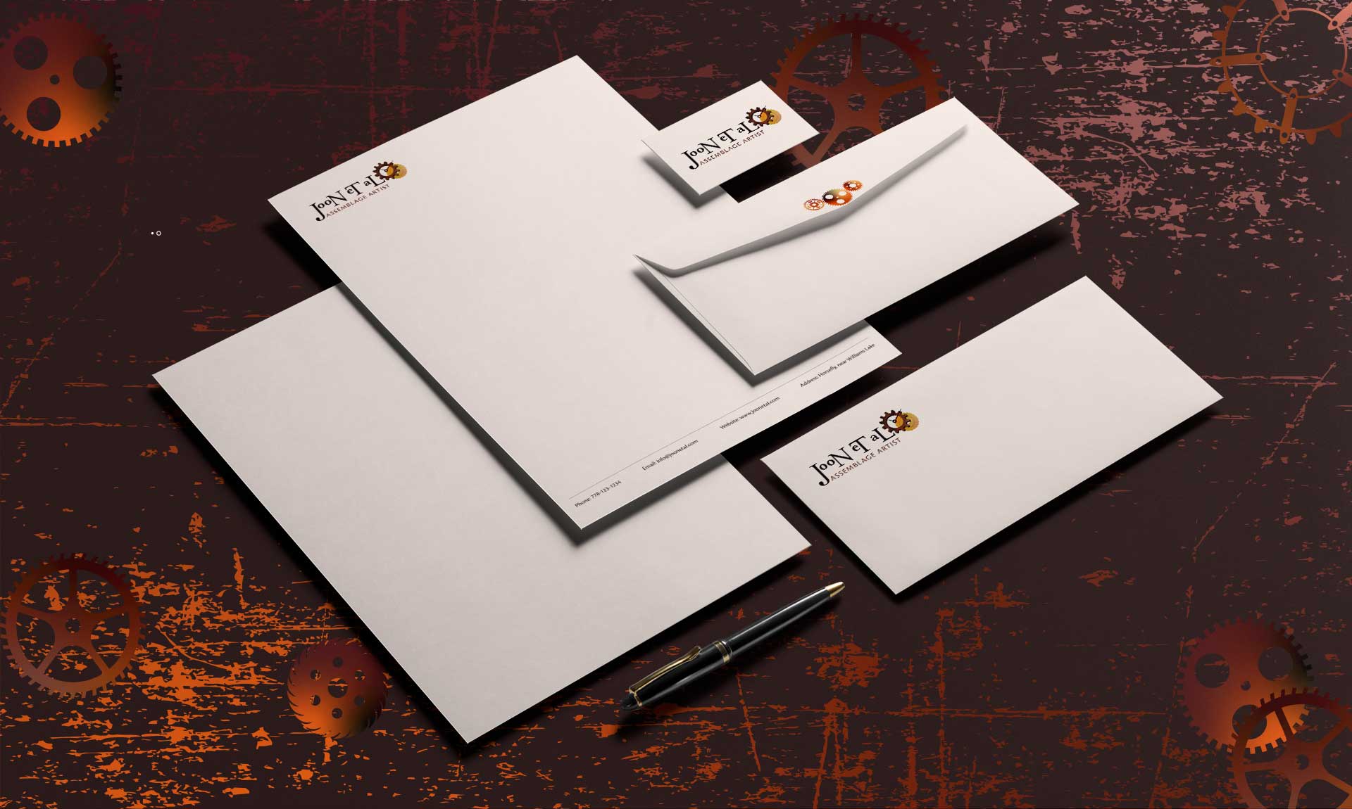
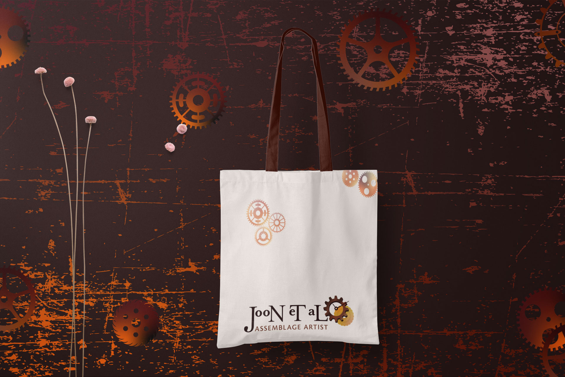
Cohesive system: Created a consistent visual language across logo, colour, and digital touchpoints that reflects June’s philosophy of beauty in imperfection.
Impact:
Increased Engagement: Crafted a calm, art-first digital experience that encourages slower interaction, contributing to an estimated 20% increase in user engagement through longer page dwell and exploration.
Cohesive Digital Identity: Developed a unified visual system across logo, typography, colour, and layout, ensuring 100% brand consistency while preserving texture, imperfection, and materiality.
Studio Experience Digitally Translated: Designed the website as an extension of June’s physical studio, resulting in a more immersive and emotionally resonant user experience aligned with her artistic practice.
LOGO DESIGN PROCESS
STAGE 1:
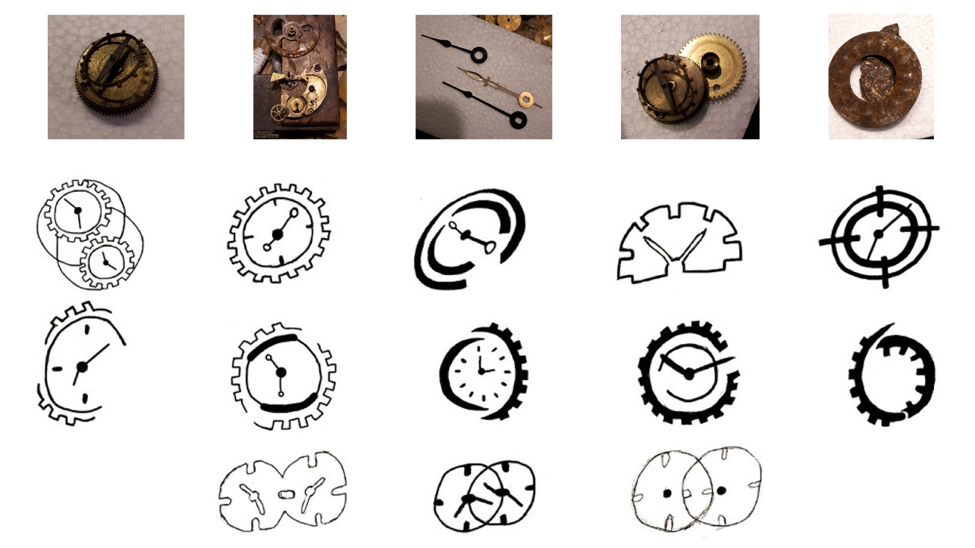
Research & Reference: June shared a series of close-up photographs of clock parts, gears, and rusted mechanisms, fragments of time that have shaped her art and her story. Her connection to clocks and movement became the foundation for the brand concept.
Form Exploration: I studied key forms such as circular gears, clock hands, and material contrast into exploratory logo sketches focused on time, cycles, and restoration.
Refinement: The initial concepts focused on themes of time, cycles, and restoration, resulting in a tactile, imperfect mark that aligns with the material-driven nature of the Joon et al brand.
STAGE 2:
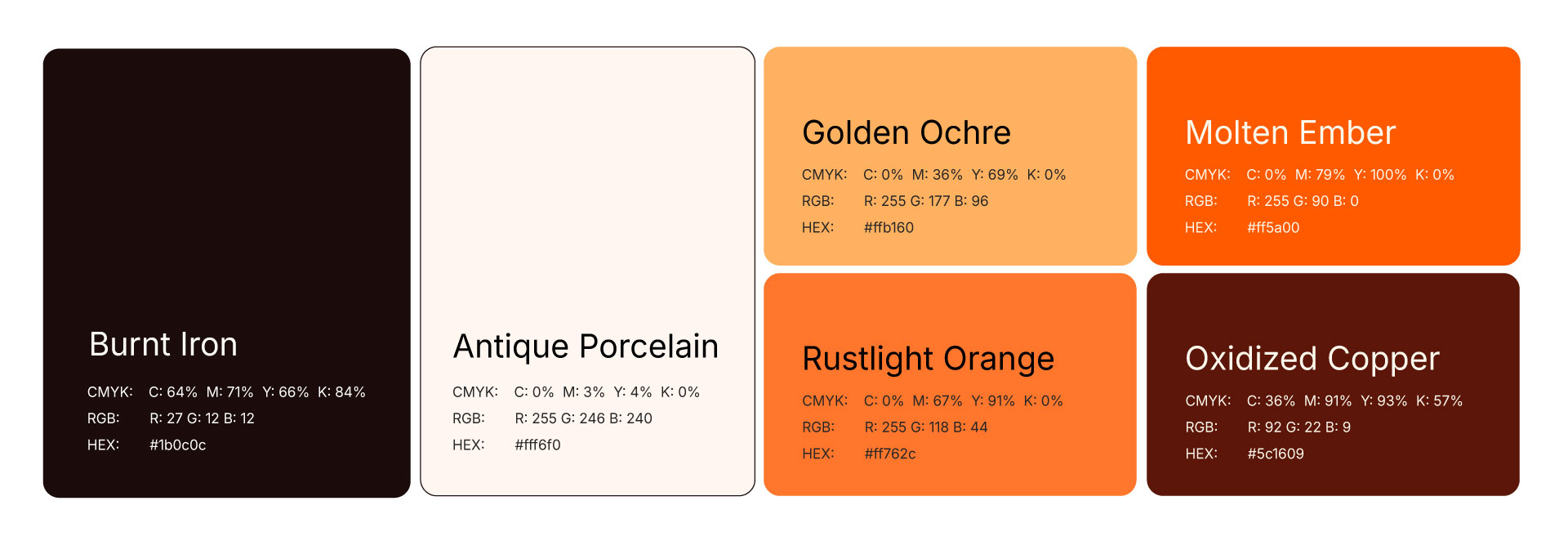
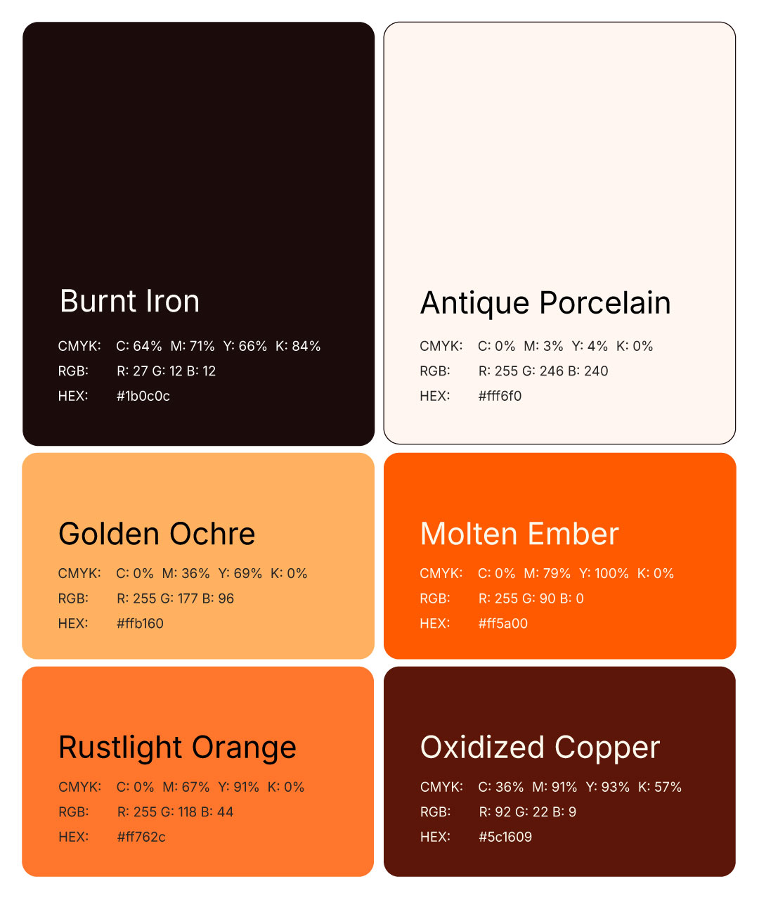
Selected warm, material-inspired tones to reflect age, texture, and transformation
Balanced soft neutrals with deeper oxidized colours to maintain restraint and clarity
Used subtle accent colours to add depth and movement without competing with the artwork
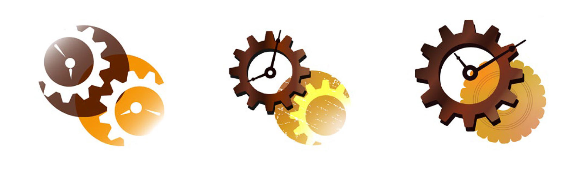
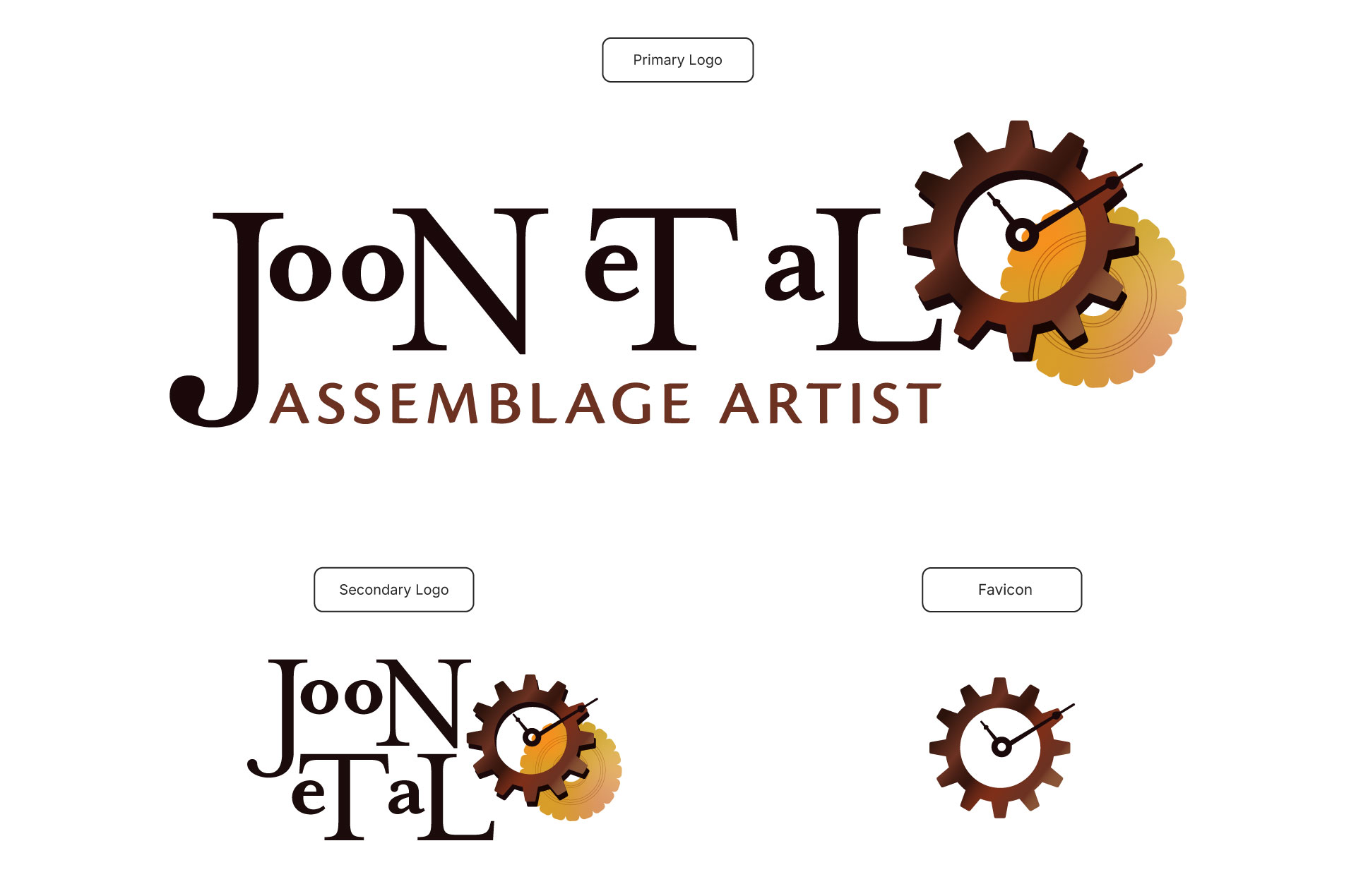
Illustrated Logo Samples: I created illustrations for the three logos that June selected, using a rustic colour scheme.
Illustrated Logo Samples: I created illustrations for the three logos that June selected, using a rustic colour scheme.
STAGE 3:
The final logo design.
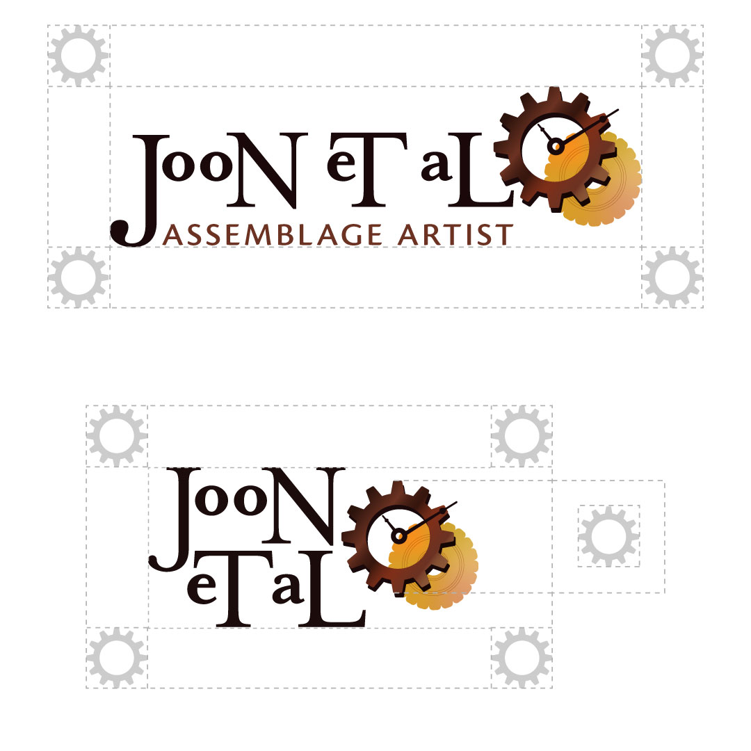
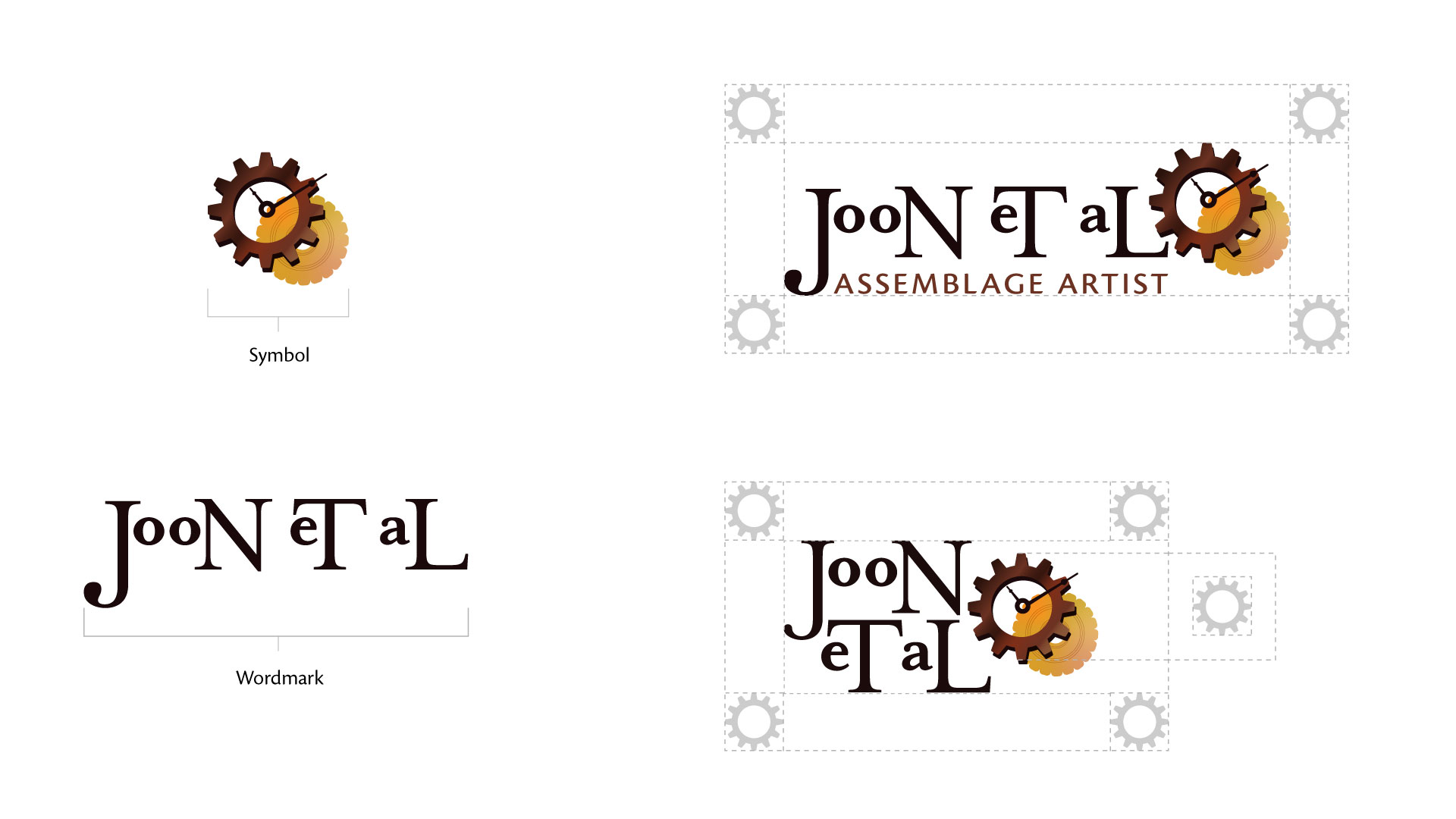
Clear Space: It’s important to have a clear space around the logo. The clear space is half of the gear icon.
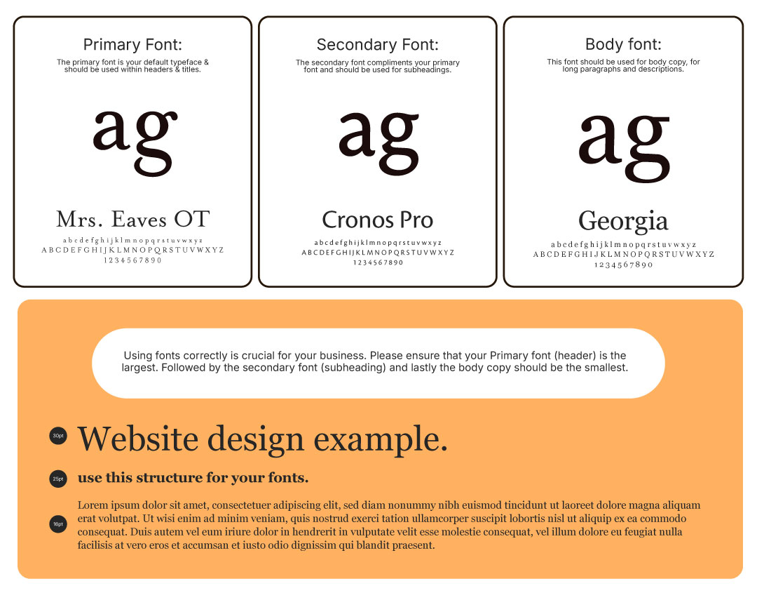
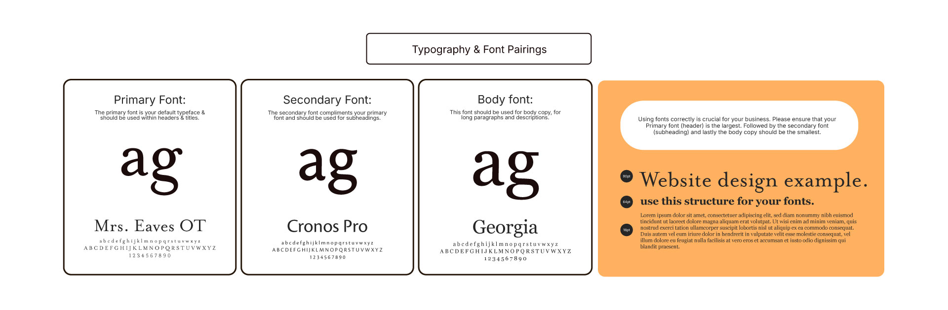
Typography:
Selected Mrs Eaves OT for the logo to convey elegance, heritage, and craftsmanship
Paired Cronos Pro for the tagline to introduce a clean, contemporary contrast while maintaining warmth
Used Georgia for the website to ensure readability and preserve a handcrafted, art-driven feel
Built a cohesive, flexible type system that supports the artwork and remains clear and user-friendly across digital touchpoints